2009年4月23日 星期四

s/s2010 color forecasting report of Chanel

From what we have known is that, the fahion industries are always led by global environment and economy. Since the global eonomy downturn will be last for years to restore, textile manufacuturers have to think of the new fibers which are more economic and can be recyled.Besides, the trend of environmental protection is now always promoted. Peoples have to think of how to use the material efficiently but not waste it. Therefore, reuse and recycling is the main trend of the fiber industries and concept for fashion design.


Chanels spirit is the simplicity and elegant but unique. We can see that the colors which Karl used always represent harmony , for example, the acromatic color scheme he used can show differences each time.Apart from the acromatic, it’s not difficult to find that Karl can use of only one color to represent his idea, such as the Spring/Summer2009 Haute Coutour, “a white page”.The dominant white is impressive but it really can express the idea from the designer. On the other hand, different color scheme can be found in spring/summer 2006 ready-to-wear. It was interesting to find that Karl included different elements (varity of color appeared )in this collection just want to tell the vitality of his collection.Base on the reaseach i have done in the blog, i notice that Karl just want to show everyone “you can make the color being you”!


Under the influences of global trends of saving energy, world protection which are mentioned before, it is no surprise that Karl will make use of his talent and include new elements inspired by nautral. For the spring summer 2010, the feeling of “netural”, “ green”, “earth” may stand out to represent casual style.The color tone will be more earth tone, such as the following pictures:


The earth tone from celebrity :


Finally, a picture of color board of the s/s 2010 comes out :


2009年4月18日 星期六

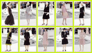
spring2005coutour


During Paris Fashion Week in October 2004、Karl Lagerfeld showed his own Lagerfeld Gallery collection for next Spring. On a midnight black catwalk、his white suits were shining. His fedora hats、starched wing collars on dresses and skinny jackets with supertight pants played on the man-woman theme. Feminine pieces also appeared、bloused and pleated dresses in hot pink、pale lavender and yellow and lighter skirts atop stiffened petticoats came down the catwalk. His evening looks which closed the show had a wispy wonderful weightless quality.

This year spring haute coutour, Karl use of analogous color scheme which have same tone and tint. The color used was creamy-like and overfall create a mood of harmony


2009年4月16日 星期四

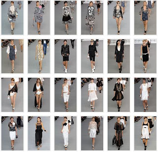
spring 2006 ready-to-wear

It seemed like the one unifying symbol of everything Karl Lagerfeld sent out in the collection: all the high-speed information about every trend of the season, communicated directly onto a computer screen in real time.

Part of the point of this is that Lagerfeld's febrile capacity for instant-uptake fashion can fill a football pitch—and yet still all look like Chanel. In reality, fashion is now more about the availability of a gazillion simultaneous choices rather than the single, old-school designer diktat. With this collection, Lagerfeld broke the taboo on saying that out loud—while also proving that a strong brand, strongly directed, can surf any trend without losing its identity.


It was a very interesting collection this time that Karl added a lot of elements in that.

We can see a lot of color scheme was used , for example :

complementary color scheme( yellow& violet)


achromatic color scheme


analogous color scheme(yellow & red)


tetrad color scheme


2009年4月15日 星期三

spring2006coutour


In this collection, achromatic scheme appeared, some of them use of complementary color scheme

complimentary color scheme

2009年4月12日 星期日

2009年4月9日 星期四

spring2007 ready-to-wear

Karl Lagerfeld dashed off yet another virtuoso demonstration of how to play up and down the classic Chanel scale in tune with any season.


As we can see that, dominat black & white color appeared toherther with baby pink and yellowish brown.

2009年4月5日 星期日

spring2007coutour


The genius of Karl Lagerfeld is his way of whacking a topical spin into every couture collection without ever compromising the ineffable core of Chanel. This time, he had a phalanx of men roll out a giant double-C rug, and struck up the band—Cat Power, who laid into some punked-up Stones and Smokey Robinson classics.

In this collection, achromatic colors again, togther with mono-cromatic in red colors.
Karl used the same tone of the colors in order to make harmony in his collection but amazing.